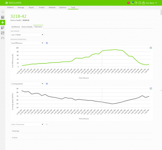
In DataV Track we needed to display telemetry data coming from the devices. Field technicians would need to use DataV Track to view recent telemetry around events, such as alarms thrown by the device, to resolve problems at the device. Business analysts would also use DataV Track to view telemetry data as a part of analyzing asset performance, identifying anomalies, and troubleshooting problems on their devices. In both situations, users would regularly need the ability to chart and compare telemetry values through DataV.
Problem
With the core telemetry experience of DataV Track designed I was tasked with enhancing that telemetry experience to allow users to compare multiple data values. Users would usually want to compare two or three data sources at a time but the product manager did not want to limit the number of comparisons they could perform. At the time, all of the data sources were time-series based but could have different units of measurement. One value could report distance over time, another velocity over time, another fuel over time, and another temperature over time and all of these would need to be compared together quickly.
Exploration
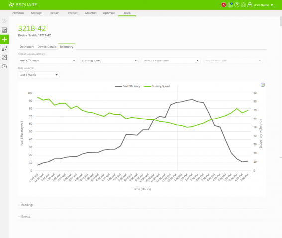
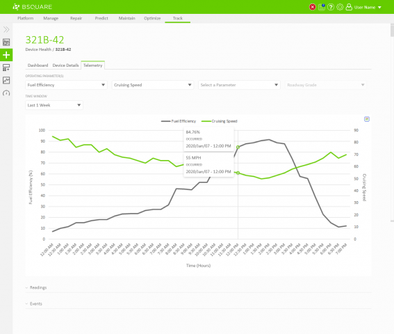
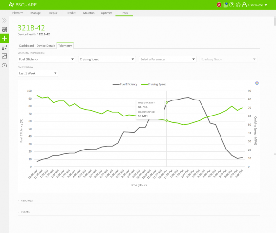
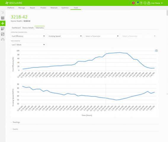
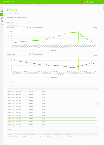
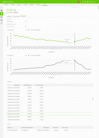
For my exploration I tried two different approaches. I created some variations of DataV Track comparing two data sources on a single chart and I created some variations of showing each data source on its own chart. Below are a few excerpts of each approach.
Single Chart
Different Charts
Review
I reviewed both approaches with the team and we were happy with both paths, but we only had the time to implement one or the other. We liked the ease of comparing different data sources on a single chart, but this really only worked well for two data sources at a time. Additional data sources would add additional y-axis labels and make the chart extremely confusing to read. Although the separate chart approach made the comparison somewhat more difficult, this solution would scale to many more data sources than the single chart approach.
We consulted with our data science team for their advice on how to compare multiple data sources. They advised that they rarely combined two or three data sources into a single chart as this was prone to leading to false impressions. Visually relating two unrelated data sets encourages users to find coincidental patterns in the data and possibly making poor business decisions from these patterns.
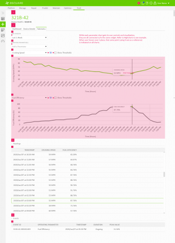
From this information we decided to proceed forward with putting each data source on its own chart. This would help avoid the problem of false impressions and would allow us to scale to as many data sources as the user needed.
Iteration
With the approach decided I iterated on how to make the comparison experience as best as possible. With some research and additional exploration, we settled on a design in which the user can select a value in one chart and view the values in the other charts that occurred at the same time.
