DataV – Resource Navigation

Navigation is one of the most impactful parts of the user experience. A pleasant navigation scheme becomes effortless while a poor navigation scheme is frustrating and irritating to its users. When designing a navigation scheme I root the design in exploration, user testing, and iterative refinement. Exploration is the process by which I ideate by combining my own ideas with established design patterns of the product I am working on and ideas I find in online research. User testing is how I identify the strengths and weaknesses of my designs from the perspective of my users rather than myself. I then take this feedback and user it to iteratively refine my designs into a final solution. The following is a case study about how the top level navigation for managing resources in DataV was designed by leveraging exploration, user testing, and iterative refinement.

Problem

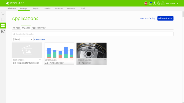
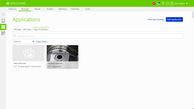
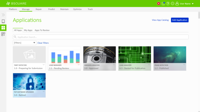
The original implementation of DataV Manage focused on allowing users to manage applications. Users could see which applications existed in the system, which applications they were responsible, and which applications they needed to review through a series of top-level tabs.

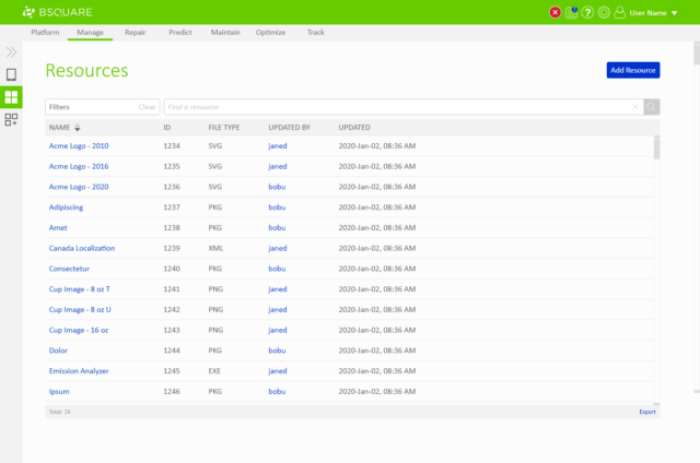
In the new design we needed to support any resource type instead of just applications while allowing users to access to the same shortcuts. 

My Role

I was the UX designer for this project working with the product manager for Manage and a UI designer. My role included exploring alternative interaction pathways, prototyping and testing the designs with sample users, iterating on the design based on user feedback, and drafting the final wireframes and documentation so the engineering team could implement the design. 
Exploration

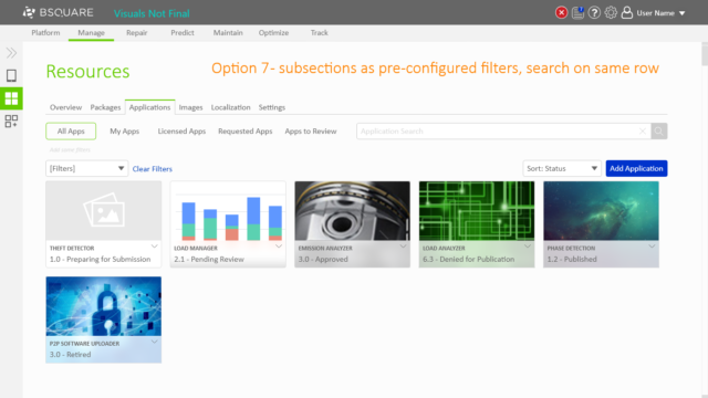
During my initial research and exploration phase I created 7 options in Adobe XD. The first 5 options represent different approaches to solving the problem and options 6 and 7 are alternative optimizations. The options are a mix of new ideas, reuse of existing DataV design patterns, and adaptations of design patterns I found as I researched the problem online.

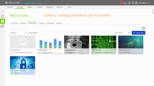
  • Option 1 showed what resource management would look like if we removed the shortcuts and used the tabs for different resource types.
  • Option 2 showed an alternative where the shortcuts remained as the tabs of the page and the different resource types went into the page’s title bar.
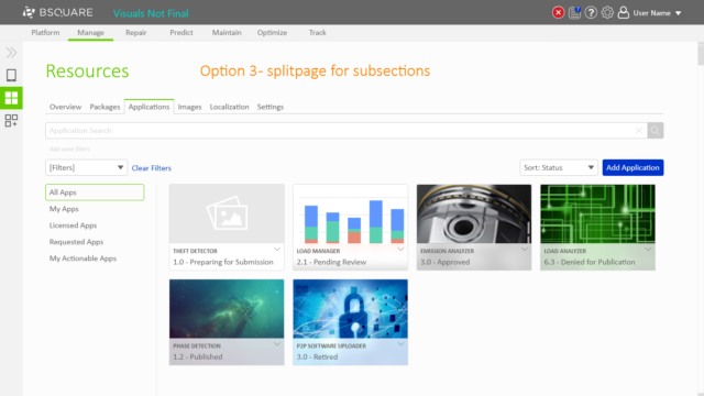
  • Option 3 leveraged our existing “split page” design pattern as a second layer of navigation underneath the tabs for the shortcut options.
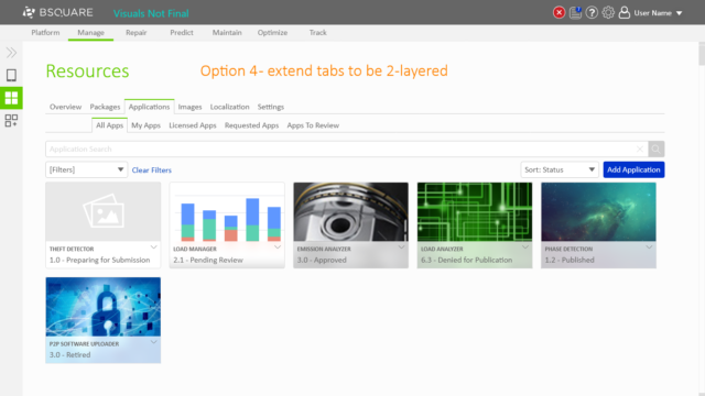
  • Option 4 explored what a two-layered tab system would be like.
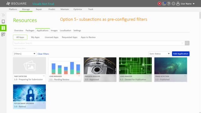
  • Option 5 adapted an idea I found in my research of pre-configured filters just underneath the tabs.
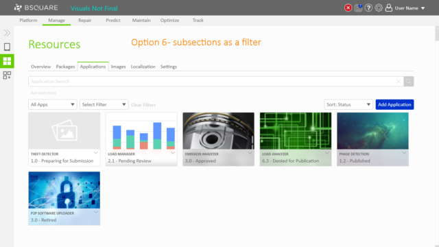
  • Option 6 took these filters and integrated them as a second drop-down in the existing filter system.
  • Option 7 was a variant of option 5 to try and salvage the lost vertical space.

User Testing

I discussed reviewed the designs with the team and we concluded that options 3 and 6 held the most promise and were ready to be prototyped and user tested. To prepare, I drafted the following problem statement to help me to focus my prototyping time and to give to users as a prompt.

You are an app developer with several applications you are responsible for within DataV. One of your colleagues has emailed you that they have approved the latest version of your efficiency app. You have the next step of publishing the application for use. Your colleague did not tell you which app they approved so you need to find it yourself. Use the tools in the provided prototype UI to find the app. 

With the problem statement in place I built and tested two prototypes in Adobe XD that allowed users to complete this problem statement.

Resource Navigation – Option 3

Resource Navigation – Option 6

I then identified candidates throughout Bsquare to serve as sample users to test with. I sought candidates from diverse backgrounds because option 6 would be repeatable in diverse situations if it panned out, allowing me to get valuable feedback on this potential path forward from multiple perspectives.

I performed user tests with 5 volunteers over a 2 week period. For each user test I gave the volunteer the problem statement, one of the two prototypes complete it on, and 5-10 minutes to complete the task while I observed and took notes. I varied which option to start with to try to eliminate bias and told the volunteer I would speak as little as possible to simulate what a normal first time user would experience. Once they finished the task we reviewed their thoughts on the design focusing on what they thought it did well and what they thought it did poorly. I then asked them to repeat the exercise on the other option and discussed the results.

The abbreviated results were:

  • All users easily interacted with both options, regardless of which one they started with.
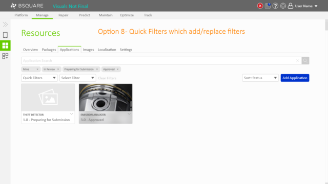
  • A good name for option 6 would be “quick filters”.
  • 3 users preferred the split page approach, 1 user preferred the filter approach, and 1 user did not have a preference.
  • The split page was highly discoverable while the filters were more efficient with their use of space on the page.
  • Having two filter dropdowns in option 6 was confusing and possibly holding it back from being better than option 3.

Iteration

Using this feedback I iterated on the designs, focusing on ways to improve the filter based design of option 6. This resulted in two new options, a new prototype, and another user test.

  • Option 8 integrated user feedback to name these new filters as “quick filters” and redefine the quick filters as collections of existing filters.
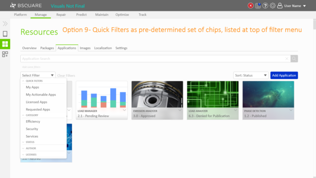
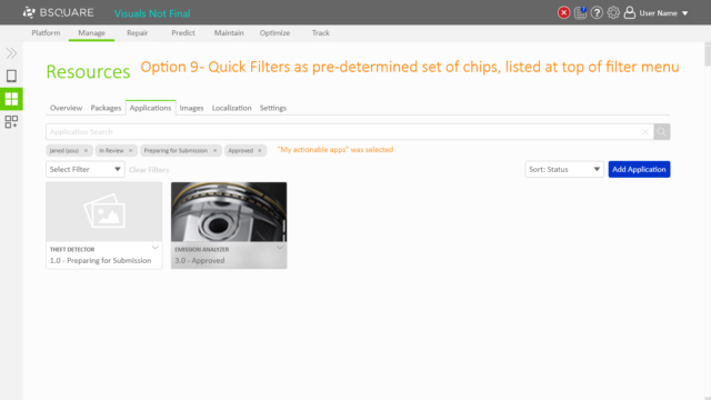
  • Option 9 took this a step further by combining the existing filters and quick filters into a single menu.

Resource Navigation – Option 9

Abbreviated results:

  • Chips are unintuitive.
  • Intrigued that quick filters can be defined as a list of filters.

User feedback indicated that option 9 was less intuitive than options 3 and 6 because the relation between the quick filters and the chips was unclear. With this feedback I iterated on how the filters worked to produce option 10, built the corresponding prototype, and performed 2 more user tests.

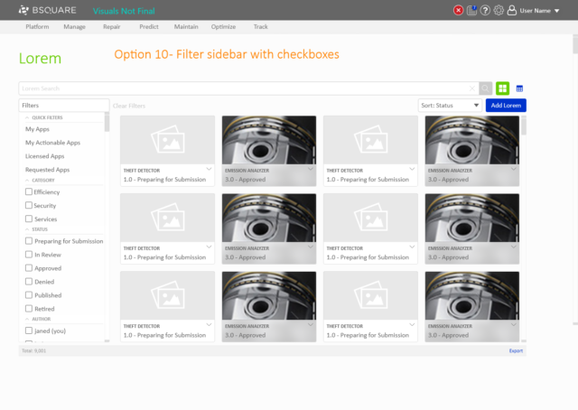
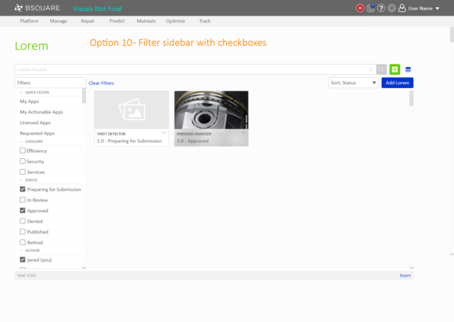
  • Option 10 refines option 9 by redesigning how the filters widget works. I researched other commonly used filter systems, such as Amazon.com and Microsoft Excel, to identify possible new approaches to the filter widget.

Resource Navigation – Option 10

Abbreviated results:

  • Sidebar of options is familiar and common.
  • Chips are more modern, but the sidebar is more clear about how the filters AND and OR together.
  • Users of DataV will appreciate the extra clarity.

From this feedback, the team and I were happy with the contained nature of the new filters and the clarity it would provide for our users. We decided to move forward with option 10’s version of quick filters as our solution to showing filtering shortcuts within DataV.

Conclusion

My design process is rooted in exploration, user testing, and iteration. Exploration is the process I use to generate new ideas by mixing my own ideas with the established design patterns of DataV and other ideas I find through online research. I utilize prototyping and user testing to get feedback from sample users to identify the strengths and weaknesses of the designs. I then take this learning and refine the designs iteratively to a final solution.