Style Guide
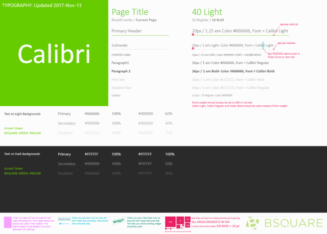
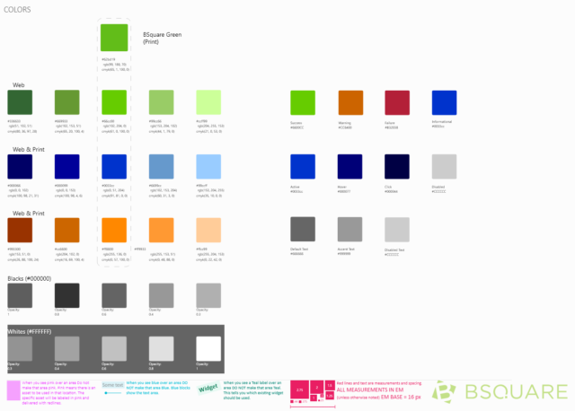
At Bsquare, I was responsible for driving consistency between the different facets of our product DataV. We needed to define our design language and the widgets that we would drive this consistency. I worked with my fellow designers to define the initial DataV style guide, which included the typography and colors that we used throughout DataV.
Widgets
Once that was established, we set out to define each widget that we would use throughout DataV. We worked to define the use cases for each widget and then iteratively design the interaction and style of each widget so that it lived within the DataV style.
Buttons
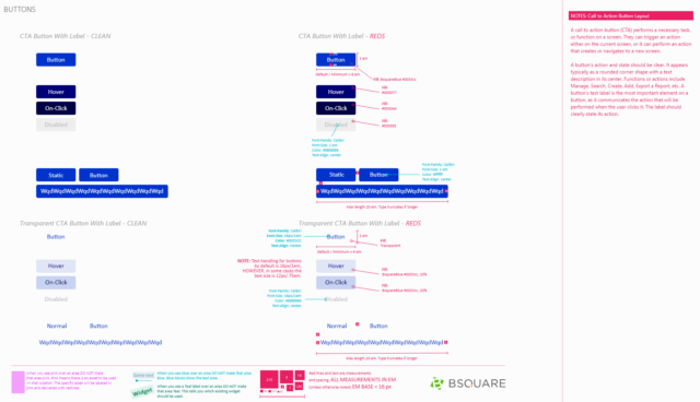
Buttons are used throughout DataV whenever we want users to be able to perform an action. We designed the buttons to be available in multiple visual weights so we could reflect the importance of the action being performed.
Filters
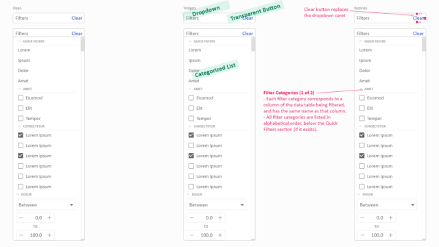
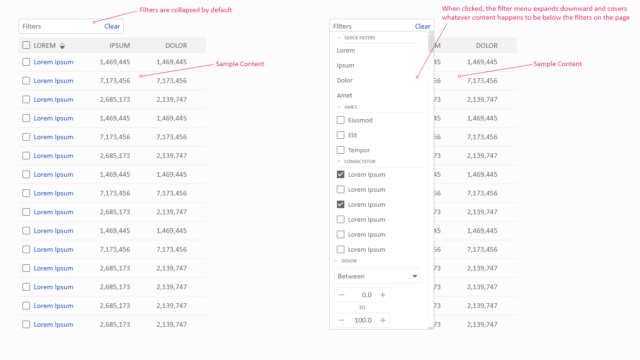
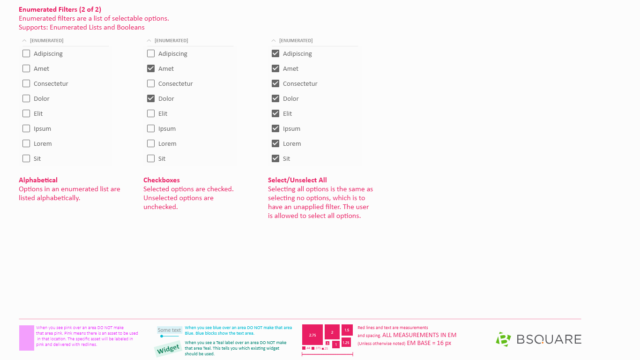
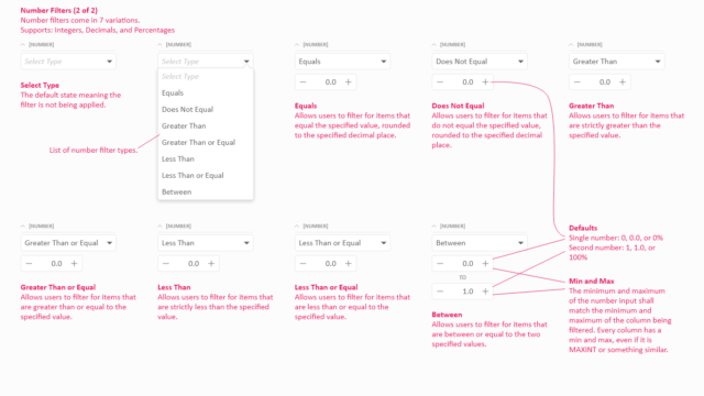
Filters exist to allow users to refine a list of items, regardless of how that list is presented and are designed to take up minimal space so that they can be used in a myriad of situations. The filters specification includes the interaction rules for how the different data types are supported.
Split Page
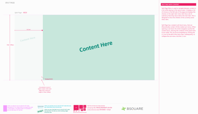
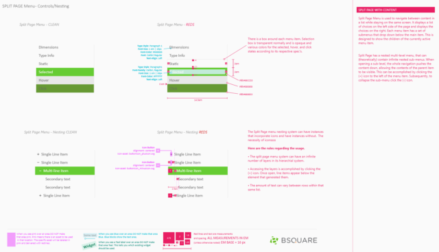
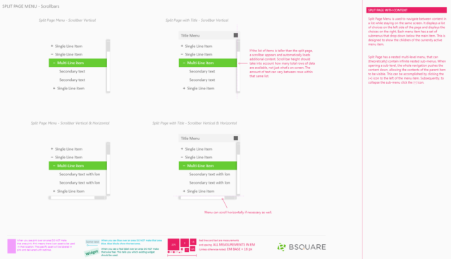
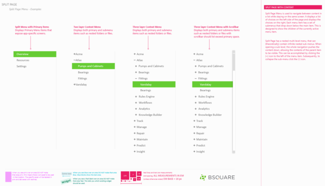
The split page widget was designed as an alternative to tabs and accordions. We generally use a split page when need a second layer of tabs or need to have many layers of tabs.
Tooltips
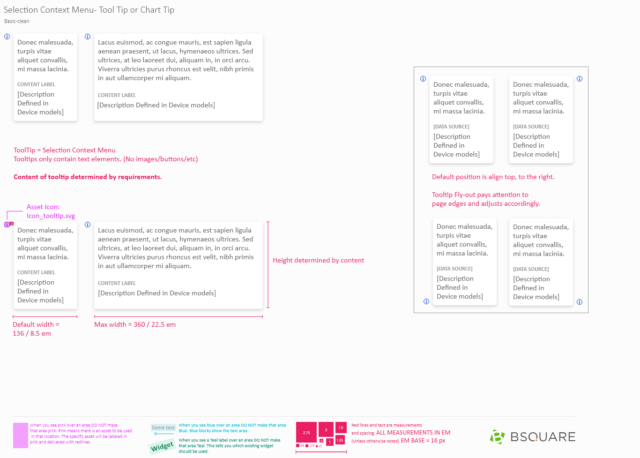
Tooltips are the primary hinting system within DataV and are designed to reduce the amount of text on screen while getting extra help and information without going into our dedicated help system.
